For my shoot i have decided to use colour medium format film with a mixture of lighting, primarily i want to use low key lighting (maybe the rembrandt style) but then i want to try high key with simple portraits.
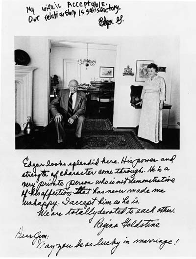
i have decided to use a jim goldberg technique and get my model to write on the photograph, i also want to experiment with the subject writing on the negatives. i beleive this will give a unique process to the quali9ty of the text and image.
Wednesday, 20 October 2010

Tuesday, 19 October 2010
Darkroom Practice
Contact Sheets
To make a contact sheet you must,
· put your negatives in a clear negative sleeve,
· you then place this underneath a plate of clear glass.
· Then you take a test strip, cut a strip of photographic paper and place under the negatives
· then expose for 5 seconds with an open aperture
· then put a piece of card, or something thick enough to block the light, over a quarter of the paper
· then expose for ten seconds
· now cover two quarters of the paper and expose for 20 seconds
· now cover three quarters and expose for 40 seconds
· now develop the test strip in the chemicals.
Once this is done you should know what time the correct exposure is and you can begin your contact sheet.
· Take a piece of paper large enough to cover all your negatives
· Place under negatives and glass
· Expose the whole sheet for the correct time indicated by your test strip
· Process the sheet.
This should give you a clear contact sheet to work with.
Paper Types
Ilford Multigrade IV RC
This is a resin coated paper meaning it is quicker and easier to process, it is also multigrade meaning it will work well with enlargers with filters. It is available in gloss, pearl and satin.
Ilford Multigrade Portfolio RC
This is very similar to the IV but is heavier and has better contrast quality than IV, this gives it a more professional look and finish than the IV/ available in glossy and pearl.
IG Galerie FB Graded
This double weight paper is fibre based giving it a better quality but a longer and more precise developing period. It is also graded meaning it has a fixed grade and is not changeable in contrast by using filters. Only available in glossy.
Kentmere VC Select
This is a budget paper but still very good. Resin coated it works with enlarger filters and is available in glossy and satin which is slightly smoother than ilfords pearl.
Friday, 8 October 2010
ALISON JACKSON
Alison jackson uses look-a-likes of iconic figures of the time (e.g princess diana, elton john and tony blair) and takes a voyeuristic veiw of there life, often inducing humour, conreversy and intrigue.
 Working with look-a-likes Jackson works on satirising the political and commercial world of celebrity, putting them in ordinary, sleazy and controversial positions. her work has caused upset, intrigue and humour , it is only when you look past these initial reactions that you understand yours and others obsession with the icon involved and why it is strange to see them this way.
 Although I do like her work I can't help but be frustrated when I hear her say "I didn't mean it to be humorous". I think she does mean it to be comic, there are plenty of examples where she must of known that it was funny. the reason she deny's the humorous side of her work is because she wants to be more artisticly acceptable.


Thursday, 7 October 2010
Image and Text
For our latest project we have been given the title image and text, i was dreading this as i do not like putting words into my images. then i remembered one of my favourite photographers. Jim Goldberg is an American photographer who uses a technique where he takes a photo of someone and then gives them the image and asks them to write there thoughts about it onto the image. i love this idea and think it gives the photo a story to the image and takes photography out of the static image we have become use to.


I also really like the work of Barbara Kruger, not so much the images but the text, its done in a very "news-paper" sstyle which make the images more eye-catching. I don't think it I will attempt to duplicate her work in any way, but i do find it interesting.


Subscribe to:
Posts (Atom)